The Jack / Jacqueline of all trades

Labeling and Artwork management is a critical aspect of product development and packaging. It involves the creation, organization, and distribution of all labeling and artwork used on a product, including packaging, promotional materials, and instruction manuals.

To guarantee that the packaging meets your brand’s requirements and is produced to a high standard of quality, companies hire Artwork Coordinators. This role, which is often undervalued, is critical to the success of product launch. Why is that?

Artwork coordination is a multi-faceted role. It involves a lot of juggling between activities that are interconnected, and working as liaison with diferent departments or stakeholders even external to your own team. It also involves some technical knowledge and a good eye for detail. All this makes an Artwork Coordinator a complex role with a lot of hidden skills needed to be successful.

Brief Creation

The artwork coordinator creates a brief/work order/request for the designer or agency responsible for producing the packaging artwork. The brief outlines the packaging requirements, including the brand guidelines, technical specifications, and any other relevant information. Being able to collate information from multiple sources, make it understandable and actionable, and distinguish between relevant and accesory information is a key still to have for this role.

The coordinator needs to ensure that the brief is clear and concise, allowing the designer or agency to create the packaging artwork that meets the brand’s requirements. If you want to know more about how this brief should look like for success, take a look at our earlier post on this matter.

Juggling of Multiple Projects and Deadlines

The role of an artwork coordinator also requires them to manage multiple projects simultaneously. It is not rare that an artwork coordinator would be dealing with tens of projects at the same time. Some of them would be more urgent than others, and some would have extra complexity or require extra time to produce (e.g. think of a label versus a leaflet, or a new product versus a change).

This is why good time management and being able to see the big picture are relevant criteria, so that the workload is effectively managed, and they can ensure that all projects are delivered within the specified timeline. The coordinator needs to be able to prioritize projects based on their importance, deliver and receive input on time, and not loose control of which status each project is at.

Coordination (of course!)

Artwork coordination requires effective communication skills to gather requirements and input with different teams involved in the packaging production process. The artwork coordinator needs to understand the needs of the brand, the regulatory teams, the translation agencies, the quality team, the printer, the suppliers… to ensure that the packaging artwork meets everyone’s requirements. They need to be able to manage the project timeline and update all the parties involved with any changes or progress made. The coordinator also ensures that the artwork is produced on time and meeting the quality, regulatory, and industry requirements.

Chaser

An artwork coordinator is also responsible for obtaining approvals from various stakeholders involved in the packaging production process. They need to follow up on the approvals, ensuring that the artwork is approved on time, and any feedback is incorporated into the artwork. The coordinator needs to be persistent in chasing approvals while maintaining good communication with all stakeholders, which at times could be a hard thing to do.

Final Reviewer

An Artwork coordinator is responsible for bringing a packaging product from start to end succesfully. Therefore, after they have all feedback incorporated into the design, they will then proceed to ultimately review and confirm the artwork meets all required quality standards. They check for any errors or inconsistencies in the artwork and make sure that the files are print-ready.

The coordinator also ensures that the artwork files are compatible with the printer’s specifications, minimizing any issues during the printing process. All this requires a certain level of technical knowledge about how printing works, which can be aquired with time, but always comes as a nice to have /must have criteria in job offers. So learning about color separation, bleeds, kerning, pantones, varnish or proofing is not a bad idea if you are considering a job like this!
We have put together a simple PDF explaining the multiple “hats” of an artwork coordinator.
Download it if you are interested in being an artwork coordinator or want to explain to your parents what it is that you do for work 🙂

The battle between designers and clients

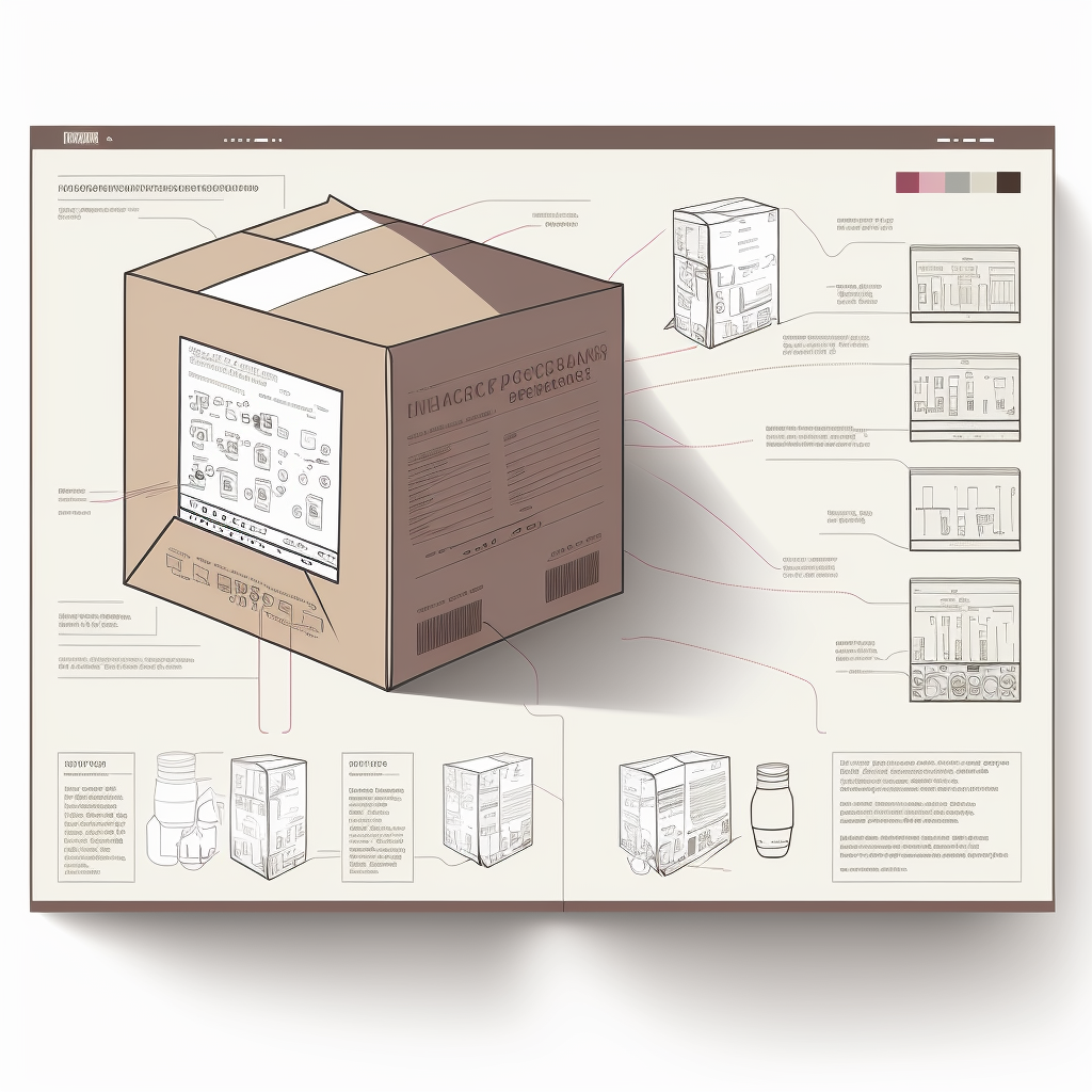
Image created with Midjourney

Effective communication is crucial for the success of any well thought through design project, more so in packaging design for highly regulated ventures such as pharmaceuticals and food. One of the key aspects in the field related to the communication between designers and clients, which can be very challenging at times, particularly when it comes to the approval of designs. This challenge is particularly relevant when tracking multiple design versions. Read on as we explore the key challenges and discuss the benefits of implementing a digital design approval process.

The Challenges

The lack of clarity in the feedback provided by clients is one of the biggest challenges (and pains that designers have to suffer) in the approval process. Designers may create a design that meets the client’s requirements (in principle), only to receive feedback that is not clear, ambiguous and difficult to follow. This can lead to a frustrating back-and-forth process, usually by email, that wastes time and may not lead to a satisfactory outcome.

In any design process, it is unlikely that the first version will be approved and multiple iteration are usually needed. The designer may create several different iterations to explore different ideas and make changes based on client feedback. It can be challenging to keep track of all these files, which can result in confusion and mistakes. The larger the number of version, the higher the risk of introducing a mistake that is eventually printed.

The benefits of a digital approval tool

Many designers have turned in the past few years to digital design approval processes. With a digital process, designers can present their designs to clients in a clear and organized way, making it easier for clients to provide feedback and streamlining the overall design workflow. The digitalisation of the approval process also allows for tracking multiple versions of a design, which helps eveyone stay on the same page.

Some of the benefits of a digital approval tool are:

  • It can save time. Instead of going back and forth through email or in-person meetings, the digital process allows for quick and easy communication between designer and client. This can help speed up the approval process, which is essential when working on tight deadlines. It also keeps all the information in one single place. This is called: Single Source of Truth.
  • It can help reduce errors and misunderstandings. By presenting designs in a clear and organized way, the designer can reduce the risk of miscommunication and ensure that the client understands the design and any changes that are made. Visibility is essential in an effective communication channel.

A digital process can definitely help improve the overall quality of the design while reducing miss-communication risks and providing a streamline workflow . By allowing for easy collaboration and feedback, all stakeholders can access true and accurate information regarding the designs.

Are you using a Digital Approval System? If not, what are you waiting for?

We make more rounds to avoid mistakes…the Fallacy

Midjourney image

Have you ever heard from a client that the reason they make so many rounds or checks (and they seem to be proud) is to avoid mistakes in the final product?

I translate this as “reducing the probability of making a mistake” in the design of the packaging.

Well….let me tell you this:

THEY ARE LYING TO YOU

Anybody that can do statistical analysis

Designing and creating designs for packaging materials, specially for food, retail and pharma, is a complex process that involves multiple rounds of designing, checking and refinement. One might expect that with each additional round of design and checks, the probability of making a mistake decreases. However, this idea is counter-intuitive and exploring the math clearly shows how more rounds of changes do indeed lead to a higher probability of making ANY mistake. Let’s check it out, it is not too complex.

The Setup

Let’s say that the probability of making a mistake when implementing a design is 1/10, or in other words, 10% of the times a designer will make a mistake. It does not matter if this number is realistic or not. More experienced designers will make mistakes less often than more experienced ones. The numbers do not affect the calculation and are only used to showcase the scenario.

Let’s also say, that we want to know that is the probability of making ANY mistake when making 1 design round versus 4 rounds of changes. In the first case, for a single round, the probability of making a mistake is set at 10%. For the second case, the probability of making ANY mistake after 4 rounds, we need a bit of math. Don’t be afraid, it is simple.

The Proof

The probability of NOT making a mistake on any given design round is 1 – 1/10 = 9/10 (so 90%). The probability of NOT making a mistake on all four consecutive design rounds is (9/10)^4 = 6561/10000 (so 65%).

To find the combined probability of making ANY mistake, we subtract the probability of NOT making a mistake on all four consecutive actions from 1:

1 – (9/10)^4 = 1 – 6561/10000 = 3439/10000 = 0.3439 = 34.39%.

So the combined probability of making ANY mistake if you execute 4 consecutive design rounds is 34.39%.

That is more than 3 times the probability of making a mistake on a single round. This is key, so clients can understand that a well-defined brief and instructions improve the odds of nailing the design in the first round, which then reduces the probability of making a mistake on further design rounds.

Fell free to send this proof to your clients so they start sending better briefs (including accurate technical specs).

Are you measuring your team’s performance?

Image by Midjourney

Key Performance Indicators (KPIs) are a set of metrics that help organizations evaluate the success of their strategies and models, and monitor their progress towards achieving their goals. In the context of a design team working on packaging materials for pharmaceutical products, KPIs are particularly important as they provide valuable insights into the team’s productivity, efficiency, and effectiveness. They help track your chosen workflow and allow you perform a continuous improvement programme. By tracking and analyzing KPIs, the team can identify areas for improvement, make more informed decisions, and achieve better results.

There are many KPIs that can be used to evaluate the performance of a design team. Different organizations work under different predicaments and models, which can influence the overall objetives: reduce time-to-market, reduce number of reworks, minimise risk of errors, etc. Three of the most common design KPIs are: the number of iterations required before approval, the time spent in each stage of the workflow, and the number of processed jobs per team member.

N versions before Approval

The number of iterations required before approval measure the number of times a design has to be revised before it is finally approved. A high number of iterations can indicate that there is a problem with the design process or that the team is not communicating effectively with stakeholders (if you are experiencing this, maybe you want to consider THIS article). It can also be a sign of a lack of clarity in the design brief, an unstructured design process, a lack of relevant SOPs and documentation and a wide range of other design-process maladies.

Time to move on

The time spent in each stage of the workflow, measures the amount of time the team spends on each stage of the design process, from conception to final approval. It allows you to zoom in on each step of the process and see what is really going on. This information is valuable as it helps to identify bottlenecks in the workflow. Additionally, the time spent in each stage can provide insights into the team’s capacity, allowing them to plan more effectively and allocate resources more efficiently.

What’s your workload

The number of processed jobs per team member, measures the productivity of each team member by tracking the number of jobs they complete in a given time period or in certain stages of the workflow. This information helps to identify individual strengths and weaknesses, which can then be used to optimize the allocation of tasks within the team. It can also provide insights into the workload of each team member, helping to ensure that they are not overburdened, which can lead to burnout and decreased productivity. It is important to filter this information with the right parameters, not all jobs are the same nor they take the same amount of time and resources. Filter wisely, one designer processing 3 multi language packs per day might be more efficient than another who moves around 10 simple jobs.

Kaizen baby, kaizen

KPIs are not only useful for evaluating the performance of a design team but also for setting a starting point for process improvement. By regularly tracking and analyzing KPIs, the team can identify areas for improvement and make informed decisions about how to optimize their processes and improve their performance. This is not only valuable for in-house processes, but also for evaluating external stakeholders. If your design efforts are outsouced, you can gain valuable insight into their effectiveness. If your customers are giving you a hard time with delays on approvals, hard KPI data will be valuable for a hard discussion with them about meeting deadlines.

Are you measuring your design team performance? If you said no, you need to take some time to think about it. If you said yes, the follow up question is: how exactly are you tracking the progress?

Send this to your (design) clients

Design briefs are essential for creative projects as they help set clear expectations and define the scope of work. However, working with a design brief that has missing (or useless) information such as low-quality images can be a significant challenge. Below you will find the key challenges faced when working with an incomplete design brief and obtain tips on how to create a clear and comprehensive brief.

You must read this if you are a customer

Every designer in the world

The classical challenges

One of the major challenges of working with a design brief that has missing information is the lack of clear guidelines. This often leads to confusion and misinterpretation, resulting in a final product that does not meet the client’s expectations. For example, if the brief does not include all the reference files or text documents, the designer may struggle to understand the client’s request and produce an artwork that is not in line with their requirements.

Another common mistake is the use of low-quality (or low-resolution) images. When the final design needs to be printed, such as packaging materials for like…..everything that is sold, the images provided to the design team need to have sufficient resolution for the required printing size and method (SPOT and Digital Printing can be different). This not only affects the quality of the final product but also the reputation of the designer and the company they work for. Although, in all likelihood, your designer will probably have to reject the job and ask for better images.

5 things you need to do as a customer

It is of the outmost importance to create a clear and comprehensive design brief that includes all relevant information. Here are five tips to help make the brief clear:

  1. Include clear brief information: The brief should include a clear and concise description of the project’s goals, technical specifications and in general the desired outcome. This will help the designer understand the client’s vision and ensure that they are on the same page. Do not make it more difficult that it needs to be….more is not always better.
  2. Add up-to-scale dielines: Dielines are essential for product design, as they provide a template for the designer to follow when creating the final product. This is particularly critical for packaging materials since it will most likely be the input of a packaging machine when mistakes can be very costly. By including up-to-scale, clean and usable dielines in the brief, the designer can ensure that the final product will meet the client’s technical specifications. If you think a blurry scan of a dieline is good enough…..think again.
  3. Include all text documents: The brief should include all text documents that are relevant to the project, such as product descriptions, marketing materials, regulatory texts, and any other content that will be used in the final product. The designers cannot read your mind, they cannot possibly know all the details of the regulatory bodies of the many countries where you are releasing and have no insight on your company’s strategies. Don’t make it difficult, make it nice. If a text needs to be included, please add a readable document that can be copy-pasted (designers do not type).
  4. Add clear and precise annotations: Sometimes the best way to convey an idea is by annotating an existing document indicating any specific requirements or requests that the client has. Be like water, be clear.
  5. Include all relevant references of essential information: The brief should include references to any essential information that the client feels is important, such as brand guidelines or examples of similar products. If it takes time to find those documents, better do it before hand.

Working with an incomplete design brief can be a significant challenge for designers, but with the right tools and tips, it can be overcome. Remember, too much information is just as bad as too little information, so be sure to strike the right balance and keep the brief concise, yet comprehensive. And always remember, a good design brief is like a GPS – it helps you reach your destination with ease!

3 Key aspects of medical illustrations

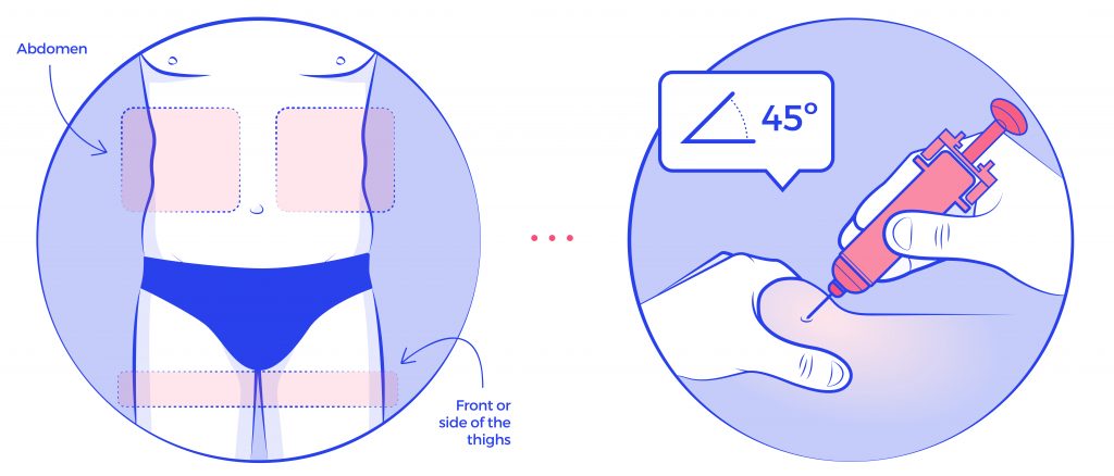
Illustration by Twona Studio (artist Belinda Ramos)

Illustrations are a fundamental tool for communicating information about medical devices to patients and healthcare professionals. In order for these illustrations to be effective, they must be relevant, accurate, and well-thought-out.

Relevance

The illustrations should be directly related to the device in question and should provide information that is useful and relevant to the intended audience. For example, an illustration of a medical device used for a specific condition should be included in the documentation for that condition.

Accuracy

Accuracy is another crucial aspect of illustrations depicting medical devices. Inaccurate illustrations can lead to confusion and even errors in use, which can be dangerous for patients. Therefore, it is essential that illustrations are based on accurate, up-to-date information and are reviewed and approved by experts in the field. Additionally, the illustrations need to be easy to understand by the appropriate audience. A healthcare professional might have received appropriate training, but in many occasions the intended user might not have received any training at all.

Design

The third important aspect of relevant, accurate and well thought through illustrations is that they should be well-designed to effectively communicate the intended message. The illustrations should be clear, concise, and easy to understand. They should also be visually appealing, as this can help to engage the reader and make the information more memorable. The illustrations should be placed in a logical and meaningful way in the leaflet or other medical documentation to make it easy for the reader to follow and understand.

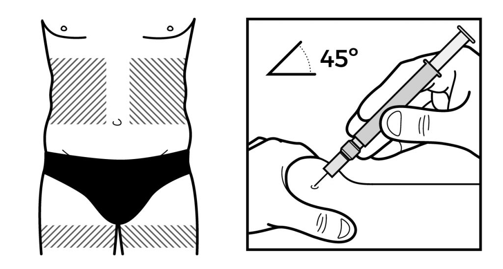
Illustration by Twona Studio (artist Belinda Ramos)

Medical illustrations are essential when it comes to communicating information about medical devices to patients and healthcare professionals. They can greatly enhance the effectiveness of instructional materials by making complex information easy to understand, and by ensuring correct application and treatment.

If you need to improve your medical devices illustrations, reach out to our Studio and we will be happy to chat with you.