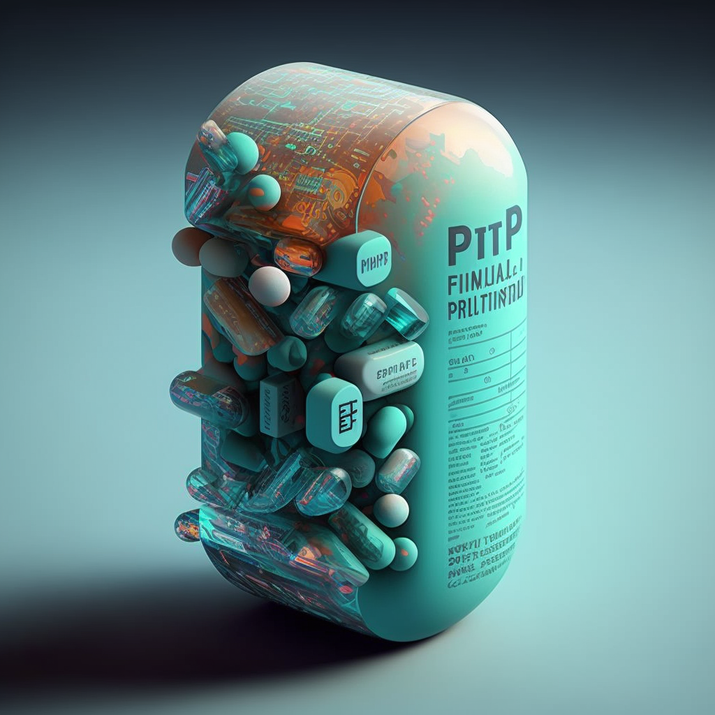
Mistakes on medical leaflets

The packaging of pharmaceutical products is a crucial aspect of the industry. It serves not only as a protective barrier for the product, but also as a means of communication between the releaser and the consumer. The releaser, a pharmaceutical laboratory, must ensure the existence of an appropriate pharmacovigilance system that allows him to assume his responsibilities and obligations in relation to the pharmaceutical specialties he markets and ensure the adoption of appropriate measures when necessary.

Risks and consequences

One of the most important components of pharmaceutical packaging is the leaflet, also known as the patient information leaflet (PIL), which provides information about the product, including its intended use, side effects, and usage instructions.

To check the content of a leaflet thoroughly is critical, as even a small typo, missing text, or added text can have significant consequences for the patient and the releaser.

Why?

Midjourney image

It is important to avoid errors in the leaflet because they can result in medication errors. For example, if a typo results in the incorrect dosage instructions being printed on the leaflet, the patient may take too much or too little of the medication, which can have serious consequences for their health. Similarly, if important information about side effects is missing or incorrect, the patient may not be fully aware of the risks associated with taking the medication. Believe me, there are side effects which patient and relatives should be fully aware from small possible irritations to a tendency to gambling, side effect that is only revealed after clinical trials for obvious reasons.

Deviation in the leaflet can also result in recalls and legal issues for the releaser. A recall is a costly and time-consuming process, as it requires to retrieve all the affected products from the market and replace them with new, corrected versions. In some cases, the recall may result in significant financial losses, as well as a damaged reputation and loss of trust from consumers.

As a designer and knowing the sensitivity of this situation, the corresponding procedure, quality documents and relevant tools are essential. Just thinking about the lack of an appropriate software 15 years ago makes me dizzy.

How to avoid mistakes

Midjourney image

In order to avoid errors in the leaflet, it is important to have a robust quality control process in place. This may involve multiple rounds of review and testing by different employees within the company, we call it four eyes principle. The process should also include a thorough review of the final product before it is released to the market, in order to catch any last-minute changes or mistakes.

In conclusion, checking the content of a leaflet in the packaging of pharmaceutical products is a crucial step in ensuring patient safety and avoiding costly recalls and damage to brand image. By having a robust quality control process in place, releasers can avoid errors and ensure that the information provided in the leaflet is accurate and up-to-date. Patients can also play a role reporting any discrepancies to their healthcare provider. By working together, the industry and consumers can ensure that the information provided in the leaflet is accurate and that patients receive the best possible care.

Send this to your (design) clients

Design briefs are essential for creative projects as they help set clear expectations and define the scope of work. However, working with a design brief that has missing (or useless) information such as low-quality images can be a significant challenge. Below you will find the key challenges faced when working with an incomplete design brief and obtain tips on how to create a clear and comprehensive brief.

You must read this if you are a customer

Every designer in the world

The classical challenges

One of the major challenges of working with a design brief that has missing information is the lack of clear guidelines. This often leads to confusion and misinterpretation, resulting in a final product that does not meet the client’s expectations. For example, if the brief does not include all the reference files or text documents, the designer may struggle to understand the client’s request and produce an artwork that is not in line with their requirements.

Another common mistake is the use of low-quality (or low-resolution) images. When the final design needs to be printed, such as packaging materials for like…..everything that is sold, the images provided to the design team need to have sufficient resolution for the required printing size and method (SPOT and Digital Printing can be different). This not only affects the quality of the final product but also the reputation of the designer and the company they work for. Although, in all likelihood, your designer will probably have to reject the job and ask for better images.

5 things you need to do as a customer

It is of the outmost importance to create a clear and comprehensive design brief that includes all relevant information. Here are five tips to help make the brief clear:

  1. Include clear brief information: The brief should include a clear and concise description of the project’s goals, technical specifications and in general the desired outcome. This will help the designer understand the client’s vision and ensure that they are on the same page. Do not make it more difficult that it needs to be….more is not always better.
  2. Add up-to-scale dielines: Dielines are essential for product design, as they provide a template for the designer to follow when creating the final product. This is particularly critical for packaging materials since it will most likely be the input of a packaging machine when mistakes can be very costly. By including up-to-scale, clean and usable dielines in the brief, the designer can ensure that the final product will meet the client’s technical specifications. If you think a blurry scan of a dieline is good enough…..think again.
  3. Include all text documents: The brief should include all text documents that are relevant to the project, such as product descriptions, marketing materials, regulatory texts, and any other content that will be used in the final product. The designers cannot read your mind, they cannot possibly know all the details of the regulatory bodies of the many countries where you are releasing and have no insight on your company’s strategies. Don’t make it difficult, make it nice. If a text needs to be included, please add a readable document that can be copy-pasted (designers do not type).
  4. Add clear and precise annotations: Sometimes the best way to convey an idea is by annotating an existing document indicating any specific requirements or requests that the client has. Be like water, be clear.
  5. Include all relevant references of essential information: The brief should include references to any essential information that the client feels is important, such as brand guidelines or examples of similar products. If it takes time to find those documents, better do it before hand.

Working with an incomplete design brief can be a significant challenge for designers, but with the right tools and tips, it can be overcome. Remember, too much information is just as bad as too little information, so be sure to strike the right balance and keep the brief concise, yet comprehensive. And always remember, a good design brief is like a GPS – it helps you reach your destination with ease!

Challenging times for the cosmetics industry

Image generated with Midjourney

The European beauty, personal care, and cosmetics industry is being challenged at the moment, with multiple regulations and changes to earlier ones taking effect during this and coming years.

One major change happened in April 2022, with the amendment to the cosmetics regulation that affected product labelling. This change was made to ensure the safety and well-being of consumers, improve market surveillance and create a level playing field for cosmetics companies within the EU. The new regulation has set several deadlines that companies must meet by 2023.

Ingredients list

The cosmetics regulation requires companies to provide detailed information on the ingredients used in their products. Companies must list the ingredients on the product label in descending order of concentration, and provide a full list of ingredients on their websites or through a consumer hotline. This information must be available by July 2023, and will help consumers make informed decisions about the products they purchase, including any potential allergens or harmful ingredients.

In relation to this, the list of allergenic chemicals that need to appear in the label if found in fragrances or essential oils at levels greater than 0.001% for leave-on products or 0.01% for rinse-off products, was increased to 81.

Warnings

Another major change to the cosmetics regulation is the requirement for companies to provide warning and precautionary statements on their product labels. This includes information on the safe use of the product, such as the recommended usage, and any potential risks associated with the use of the product. Companies were required to provide this information by January already, and it will help consumers make informed decisions about the use of cosmetic products and reduce the risk of adverse reactions.

Non-compliance measures

In addition to the new labelling requirements, the EU has increased its resources for market surveillance to ensure that companies are complying with the new regulations. This includes unannounced inspections, random sampling, and regular monitoring of companies. The EU is expected to take enforcement action against companies that fail to comply.

There is no doubt that the recent amendment to the cosmetics regulation is a significant step forward in ensuring the safety, transparency and sustainability of the cosmetics industry in the EU. However, the changes come hand in hand with other regulations that even if not specifically crafted for it, also affect this sector. Examples of such are the European restriction on microplastics, or the EU Packaging and Packaging Waste directive – which we may address at a later time.

The amount of changes and the need to adhere to new regulations is making it essential for people in the industry to closely monitor all information around these topics and connect with key sources in order to avoid fines, and other penalties due to non compliance. In many cases, this is also leading to re-labelling/re-packaging of certain lines of products for cosmetics manufacturers.

How are you keeping up to date with all these regulations?

Are you struggling to meet deadlines when it comes to re-packaging /relabelling your products?

Do you find it difficult to confirm if your products are compliant?

If that is the case, these links may be interesting for you:

Human resources vs non-human resources

Photo by Carl Heyerdahl on Unsplash

Currently, there are several countries in Europe experimenting with shorter working weeks. If you are not familiar with it, we are talking about reducing work days to 4 days a weekThe other option, very well established in Scandinavian countries like Sweden, is to reduce the number of daily hours to 6 hours per day, instead of 8. 

For the sceptics, no, this model it is not only possible for countries of a certain size:

  • Iceland: between 2015 to 2019, Iceland conducted the world’s largest pilot of a 35 to 36-hour workweek (cut down from the traditional 40 hours) without any calls for a commensurate cut in pay.
  • Belgium: in February, Belgian employees won the right to perform a full workweek in four days instead of the usual five without loss of salary.
  • UK: Companies in the UK that have run a six-month trial of the four-day workweek are now planning on making the shorter workweek permanent, after hailing the experiment as “extremely successful”.
  • Germany: is home to one of the shortest average working weeks in Europe. According to the World Economic Forum (WEF), the average working week is 34.2 hours. Last year, IG Metall, the country’s largest trade union, called for shorter working weeks, arguing it would help retain jobs and avoid layoffs.
  • Spain: in December Spain launched a pilot programme of a four-day working week.

This work philosophy is not just a fancy European experiment.

Photo by Brian McGowan on Unsplash

In Japan, it’s the larger companies that are venturing into this territory, following the Japanese government’s announcement in 2021 of a plan to achieve a better work-life balance across the nation. Meanwhile, in New Zealand, 81 employees working for the consumer goods giant Unilever are currently taking part in a year-long trial of a four-day workweek at full pay.

According to a survey by cloud-software vendor Qualtrics, a whopping 92 percent of US workers are in favour of the shortened workweek.

The employees surveyed cited improved mental health and increased productivity as the perceived benefits.

In Canada, research from global employment agency Indeed found that 41 per cent of Canadian employers are considering alternative hybrid schedules and new work styles, following the COVID-19 pandemic.

Indeed’s survey of 1,000 employers of office workers in Canada found that 51 per cent of large companies with 500+ employees would be “likely to implement 4-day workweeks”.

On the opposite side you can find the case of Spain, where many employees work longer than specified in their employment contracts, quite often for free. Yes, I know that if you are a workaholic you wouldn’t see any problem, that’s fine as long as it is your choice. 

Photo by Joshua Olsen on Unsplash

Actually, the number of hours worked after hours was so high that a specific law was created to track the time, yes, I know, welcome to the seventies. From that moment on, by law, all employees must fill up a form indicating their arrival and end time of their work day – luckily, there is software for it, we are not talking about the punching machine you see on movies to make holes at the entrance of your workplace! 

I am not going to comment on who controls that information, if there really is someone who reviews it or if something has changed. 

I personally work 6 hours a day. This schedule was put in place after a month-long pilot that we did 2 years ago, when we confirmed that the work could be done efficiently with the same quality of service, and every employee could benefit from a better work-life balance. Not taking the step is a matter of blindness. 

Could it be more interesting to have a happy employee working 6 hours than a non efficient one 10 hours in the office?

So, can we talk about the non-human resources?

In the case of Spain, what is at fault here? Employees for not rebelling to this situation, employers expecting these crazy hours? Is this an example of a chicken and egg situation?

What do you think? 

Rafael Cruz Núñez
Artwork Manager

Key concepts on barcodes for pharma

Illustration created with Midjourney

The use of barcodes has become ubiquitous in the pharmaceutical industry, providing a crucial means of identification and tracking for products in the supply chain. Accurate creation of barcodes is essential to ensure reliable digital reading and to prevent failures that can cause significant disruptions and potentially pose risks to patients, not to mention the costly and feared product recall. In this article, we will explore the importance of creating barcodes accurately and explain why the size of the barcode and the color used in the design are crucial factors to consider. We will also provide two tips to help ensure that barcodes are created correctly for packaging design.

The risks

Poorly printed or sized barcodes can cause digital readers to fail, leading to incorrect identification of products, misdirected deliveries, and even recalls. This does not only pose a danger for the patient but also a significant risk for the brand in terms of reputation and costs.

The size matters

One of the key factors to consider when creating barcodes is the size of the code. The size of the barcode needs to be large enough to be easily read by digital readers, but also small enough to fit on the limited space available on the packaging. The size of the barcode must also be consistent across all packaging to ensure reliable digital reading and to prevent confusion. However, the most important aspect of barcode sizing is following the regulated standards for the selected barcode. Some barcode types allow for more flexibility in terms for size and color while others (like the Pharmacode) are very strict in their technical specifications.

Pharmaceutical Binary Code – The Pharmacode

The pharmaceutical binary code, commonly known as the pharmacode, was first introduced in the 1970s as a means of providing a fast and efficient way to identify and track products in the supply chain. The barcode system was originally based on the Universal Product Code (UPC) developed by the grocery industry. The pharmaceutical barcode, also known as the GS1 barcode, was developed to meet the specific requirements of the pharmaceutical industry and is based on international standards established by the Global Standards One (GS1) organization. The technical specifications of the pharmaceutical barcode include a specific number of digits, with the first three digits identifying the company that manufactured the product, the next two digits identifying the product, and the last digit used as a check digit for error detection. The barcode is also required to meet certain size and printing quality standards to ensure reliable digital reading.

You should NEVER resize the width of a pharmacode.

Rafael Cruz, Studio Manager

Color also matters

Midjourney image

The color used to create the barcode is also an important factor to consider. Barcodes must be printed in high contrast colors to ensure that they are easily readable by digital readers. The color of the background and the barcode must be carefully chosen to ensure that the barcode is clearly visible and easily distinguishable from the background. The use of low contrast colors, such as light blue on white, can make barcodes difficult to read and can cause digital readers to fail.

2 Tips to help you out

To ensure that barcodes are created accurately, there are two important tips to keep in mind. Firstly, it is crucial to use high-quality printing materials and equipment to create the barcodes. This will ensure that the barcodes are clearly visible and easily readable, and will help prevent digital reading failures. Secondly, it is important to regularly test the barcodes to ensure that they are accurately readable by digital readers. This can be done by using a barcode scanner to test the barcodes and to confirm that they are being accurately read.

In summary, to ensure accurate barcode creation for pharmaceutical packaging design, it’s crucial to:

  1. Consider the size of the barcode to ensure it is easily readable by digital readers and fits the packaging space
  2. Choose high-contrast colors for printing to improve barcode visibility and readability
  3. Use high-quality printing materials and equipment
  4. Regularly test barcodes for accurate digital reading with a barcode scanner

Artwork Coordination: an often undervalued, complex role

Photo by Matt Bero on Unsplash
Photo of a business person with headset on, a backpack, wearing a shirt, crossing a zebra pad juggling some balls
Photo by Matt Bero on Unsplash

The role of an artwork coordinator in industries such as food, pharmaceutical or retail is crucial for ensuring that the packaging design of products is consistent, accurate, and meets all legal and regulatory requirements. However, this position does not always get the appreciation it deserves.

Being an artwork coordinator for the packaging design of products comes with its own set of difficulties and challenges, which can range from managing a large volume of designs, to ensuring the accuracy of information and meeting tight deadlines, amongst others:

  1. Managing a large volume of designs: Artwork coordinators are responsible for simultaneously managing a large number of designs, both for large product launches and small packaging changes, which can be a time-consuming and complex process.
  2. Maintaining design consistency: Maintaining consistency in design across multiple products and packaging, as well as keeping up to date with customer input and market inspiration (not for Pharma products, where all is more regulated) is crucial for creating a strong brand identity.
  3. Accuracy of information: The accuracy of information on packaging is crucial for ensuring product safety and compliance with legal and regulatory requirements. This is specially critical in the FMCG and pharmaceutical industries, where errors can lead to severe consequences on the consumer side. Products that are sold across multiple countries, with multi-lingual labels, represent an extra complexity on this front, to make sure that all information is accurate and meets the local standards.
  4. Meeting tight deadlines: Coordinators often have to work with very tight deadlines to ensure that products are available for sale in a timely manner.
  5. Collaboration and communication: Effective collaboration and communication between different departments and stakeholders is essential for ensuring the success of a packaging design project.
  6. Approval management: this communication and collaboration amongst departments and external parties such as external clients, regulatory bodies, or printers, takes an extra step when it comes to managing the approvals on the artworks. Dealing with both internal and external feedback rounds adds an extra layer of risk in making sure that the correct files are used when it comes to creating the final product that goes in the shelves.
  7. Control of document versions and files in general: don’t you hate it when you receive a final version and then it turns out it is no the final one, amendments are made and you lose track of which file is the one that should be used? With so many projects ongoing and multiple approvals needed, it is one artwork’s coordinator nightmare to make sure the files are correctly stored and identified.

These challenges show how important and complex the role of artwork coordinator can be. Luckily, nowadays, there are tools that can assist an artwork coordinator in their daily tasks to make them more successful and efficient.

An artwork management system (AMS) can help automate and streamline the design process, through custom workflows that will take some of the repetitive tasks out of their plate, and giving visibility to other stakeholders when they need to provide input or approve. Such technology would also make sure that designs used are the correct ones, by providing a central repository for storing and sharing artworks, keeping version control on all files. Through an audit trail on changes, it becomes much more simple to track where a design is at any given time, and who may have performed a change, taking action from there.

Artwork Management System – Twona

Reaching deadlines becomes easier, as the approval process can be automated and they only need to make sure to check feedback when completed. Because the tool would provide real-time updates on the status of designs, they can focus on more valuable activities other than chasing and reminding people. As a central platform for sharing designs and communicating with stakeholders, and AMS would improve collaboration and communication, as everyone is involved and has visibility over the process. Furthermore, additional tools such as artwork comparison/proofing systems can help coordinators verify that the information on packaging is accurate and up-to-date, reducing the risk of errors and mistakes.

The role definition does not need to change. Its beauty is that it interlocks so many areas of the packaging design process. However, it can be more appreciated when the right technology is used to support their multiple tasks, as it will help professionalize and standardize the artwork coordinator function.

On-premises vs SaaS

Even though the corporate solutions landscape has rapidly evolved over the last decade, the decision between an on-premises software installation and a SaaS cloud solution is a common one that many organizations face. There are several key differences between the two that impact cost, functionality, and security.

  1. Cost: On-premises software requires a significant upfront investment in hardware, maintenance, and upgrades. It also requires the in-house expertise in the form of developers, engineers, infrastructure and security experts. In contrast, a SaaS solution is generally sold as a subscription service and eliminates the need for a large upfront investment. This means that the cost of a SaaS solution is more predictable and often more manageable.
  2. Functionality: On-premises software offers more customization options, but it also requires more expertise to set up and manage. Development and installation takes a significant amount of time as the complexity of the required functions increases, taking several months to years to setup a system. A SaaS solution, on the other hand, is managed by the vendor. It typically offers less customization but is easier to set up and use. If the SaaS solution offers a powerful API, customization can be further extended. This can lead to a more streamlined and efficient process with a significantly lower go-live time.
  3. Security: On-premises software is often perceived as more secure because the data is stored on the organization’s own servers. However it also requires more resources and expertise to manage and protect. A SaaS solution is managed by the vendor and typically offers a higher level of security than an on-premises solution, specially when large scale, well know infrastructure providers are used, such as Amazon. It also involves more trust in the vendor and their security practices, which is typically solved with Information Security audits.

In conclusion, when deciding between an on-premises software installation and a SaaS cloud solution, it’s important to consider the cost, functionality, and security implications of each option. While on-premises software offers more customization options, it also requires more resources and expertise to set up and manage. SaaS solutions are easier to use and offer more predictable costs, but they also involve more trust in the vendor and their security practices. Ultimately, the right solution will depend on the specific needs and resources of each organization, but let’s be honest. Who in its right mind would in 2023 decide to purchase an on-premises solution when there are SaaS alternatives on the market?

Is Software Validation outdated?

Image generated with Midjourney

Software validation is the process of ensuring that software systems meet the requirements set forth by regulatory bodies, such as the FDA in the United States. This is particularly important in highly regulated industries, such as the pharmaceutical industry, where software systems are used to manage and analyze critical data that is used to support the development and manufacture of drugs.

The origin of software validation can be traced back to the early days of computer technology in the pharmaceutical industry. In the 1970s, the FDA began to recognize the importance of software validation as a means of ensuring the accuracy and reliability of data generated by computer systems. This led to the development of guidelines and regulations for software validation, specifically in the pharmaceutical industry, such as the FDA’s “Guideline on General Principles of Software Validation” in 2002.

One key document that is created during the software validation process is the Master Validation Plan (MVP). The MVP is a comprehensive document that outlines the overall strategy and approach for validating the software. It includes details such as the scope of the validation, the validation team, and the schedule for validation activities. It is the first and foremost piece to documentation that needs to be created.

Following the MVP, you need to build three key documents: OQ, IQ and PQ.

Operational Qualification (OQ) and Installation Qualification (IQ) are used to ensure that the software system is installed and configured properly, and that it functions as intended in its intended environment.

Performance Qualification (PQ) is a process of testing software systems in order to verify that it performs as intended, and that it meets the acceptance criteria defined in the Qualification Protocol (QP).

As the technology and software development methodologies have evolved since the 70s, the need to adapt the validation model for modern SaaS cloud-based solutions has become increasingly important. With the advent of cloud computing, software systems are no longer installed and run on a single machine, but rather they are accessed through the internet from various devices and locations. This is the so called “single tenant system”, which is a radically different paradigm from the early on-site installations. This has led to the development of new guidelines and regulations for validating cloud-based software systems, such as the FDA’s “Guidance for Industry: Cloud Computing and Mobile Medical Applications” in 2013, although one might argue that those models are still outdated given the speed of the advancement of technology and cloud services.

In conclusion, software validation is a critical process in ensuring the accuracy and reliability of data generated by computer systems in highly regulated environments. However, application of outdated validation methods will only led to frustration and failure.

If you are about to embark on a validation process for a SaaS solution but your QA team has only experience on traditional on-site installations, do not rush. Take your time, read the available literature, get familiar with the tools and infrastructure used by your chosen vendor and if necessary, ask for additional budget to ensure the validation is not only successful, but more importantly, relevant.

2 Challenges of multi language packaging

Image created with Midjourney

Creating and managing packaging materials for the food industry can be a complex and challenging task, especially when the products are going to be commercialised in many countries. Two of the main challenges include compliance with regulations and cultural differences. Not to mention the complexity in managing multiple packaging materials in the factory.

Compliance

Compliance with regulations is a major challenge when creating and managing packaging materials for the food industry. Different countries have different regulations regarding food packaging, including labelling requirements, food safety standards, and environmental regulations. This can make it difficult for companies to create packaging that meets the requirements of all the countries where their products will be sold. Additionally, these regulations are constantly evolving and companies need to stay up-to-date with the latest changes in order to remain compliant.

Cultural Differences

Cultural differences are another major challenge when creating and managing packaging materials for the food industry.

Different cultures have different tastes and preferences when it comes to food, and this can impact the design and messaging of the packaging. Companies need to take these cultural differences into account when creating packaging that will appeal to customers in different countries. For example, a packaging design that is popular in one country may not be well-received in another country due to cultural differences.

The multi-language setup also influences the complexity of creating and managing packaging materials for the food industry. Companies need to create packaging that includes translations of all the text, which can be a time-consuming and costly process. Additionally, the translations need to be accurate and culturally appropriate in order to avoid any misunderstandings or offence. Consistency in look, message and tone should also be considered when selling across borders.

How can you improve this?

One key advice to improve this process is to work with a professional translation agency that specialises in the food industry. These agencies have experience translating food packaging and can ensure that the translations are accurate, culturally appropriate, and compliant with regulations. Additionally, they can help companies stay up-to-date with the latest changes in regulations and cultural trends in different countries.

Another advice is to work with an agency or studio, or independent artwork designer, who is experienced in the production of multi-language packaging materials. These professionals would be able to create, edit, and review materials in different languages, as well as different alphabets before they reach your internal review teams.

Ideally, these two are working together or at least, are in contact, to speed the final delivery of correct packaging information and its formatted result for printing purposes.

And you, how do you manage your multilingual packaging projects?

3 Key aspects of medical illustrations

Illustration by Twona Studio (artist Belinda Ramos)

Illustrations are a fundamental tool for communicating information about medical devices to patients and healthcare professionals. In order for these illustrations to be effective, they must be relevant, accurate, and well-thought-out.

Relevance

The illustrations should be directly related to the device in question and should provide information that is useful and relevant to the intended audience. For example, an illustration of a medical device used for a specific condition should be included in the documentation for that condition.

Accuracy

Accuracy is another crucial aspect of illustrations depicting medical devices. Inaccurate illustrations can lead to confusion and even errors in use, which can be dangerous for patients. Therefore, it is essential that illustrations are based on accurate, up-to-date information and are reviewed and approved by experts in the field. Additionally, the illustrations need to be easy to understand by the appropriate audience. A healthcare professional might have received appropriate training, but in many occasions the intended user might not have received any training at all.

Design

The third important aspect of relevant, accurate and well thought through illustrations is that they should be well-designed to effectively communicate the intended message. The illustrations should be clear, concise, and easy to understand. They should also be visually appealing, as this can help to engage the reader and make the information more memorable. The illustrations should be placed in a logical and meaningful way in the leaflet or other medical documentation to make it easy for the reader to follow and understand.

Illustration by Twona Studio (artist Belinda Ramos)

Medical illustrations are essential when it comes to communicating information about medical devices to patients and healthcare professionals. They can greatly enhance the effectiveness of instructional materials by making complex information easy to understand, and by ensuring correct application and treatment.

If you need to improve your medical devices illustrations, reach out to our Studio and we will be happy to chat with you.